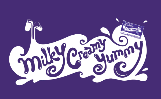
Kate Moross is another hands on creative, her hand rendered type and experimentation with all sorts of materials is really inspiring.


Moross uses geometric shapes and diverse typography to create intricate designs. She uses consistent colour pallets which contrast together allowing the piece to have an overall impact, she isn’t afraid to use colour in her work. Her work looks overall collaged together, letting type follows around shapes. Her contrast between 2D and 3D hand rendered type gives the work a sense of depth. And the different sizes of text allow some to stand out. At first the design can seem over-whelming with the high volume of pattern and colour, but they are cleverly broken down by outlines on type and shapes.

No comments
Post a Comment